MLB Stats puts all of the metrics fans care about at their fingertips.
MLB Stats puts all of the metrics fans care about at their fingertips.
Lead Designer • iOS • Product Design, User Research • 2017-2019
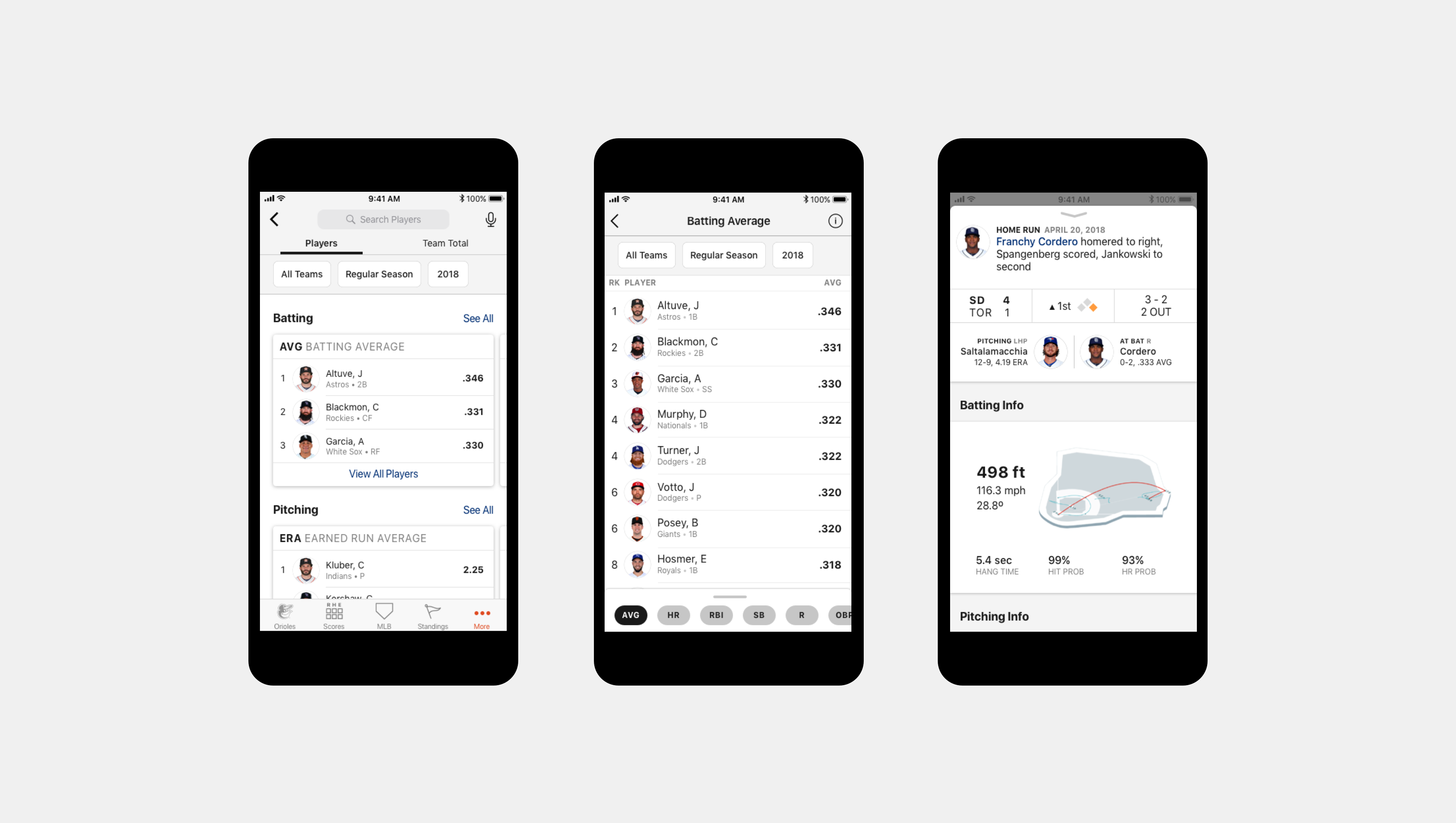
The goal of the redesign was to address the needs of casual fans - those who are familiar with basic stats like Batting Averages and Runs Batted In and would want to look these up at a game, to settle a bar trivia dispute, or while watching at home on a second screen.
Uncovering the problems
App & Site Metrics
I worked with the Analytics team to gain a picture of how users were using the different Stats products across MLB's website and within At Bat to determine if there were any specific usage patterns seen only in a mobile context.
On mobile devices (both on mobile web and native), users had only shallow interactions with stats and went deeper into stats on desktop.
Direct Feedback
I conducted multiple rounds of interviews to understand user behavior around looking up stats as well as observed how users currently use MLB's stats products as well as competitors' products.
In addition, I ran multiple rounds of interviews with prototypes throughout the design process, incorporating feedback for subsequent rounds.
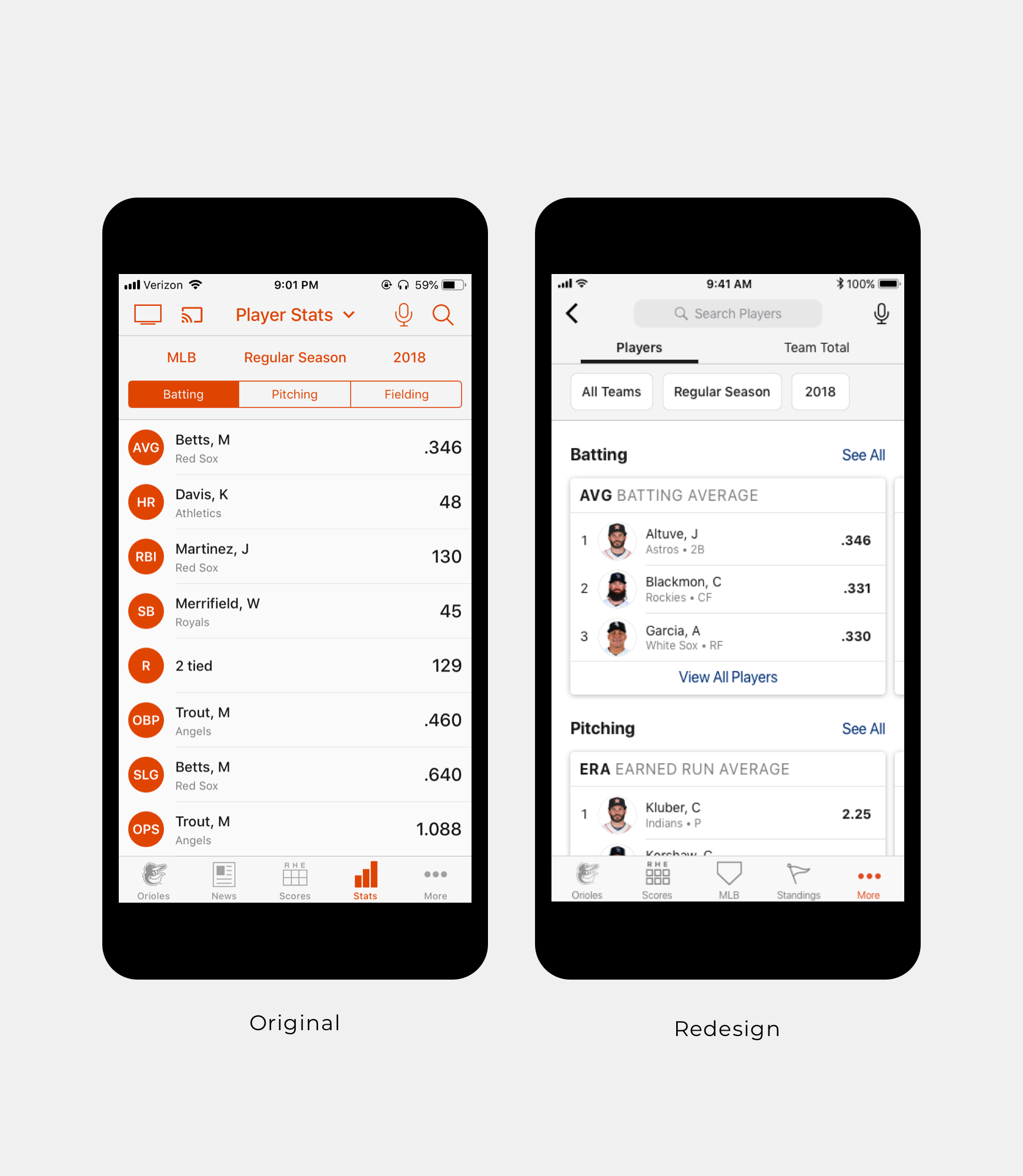
Redesigning an outdated view
Designing for various screen sizes.
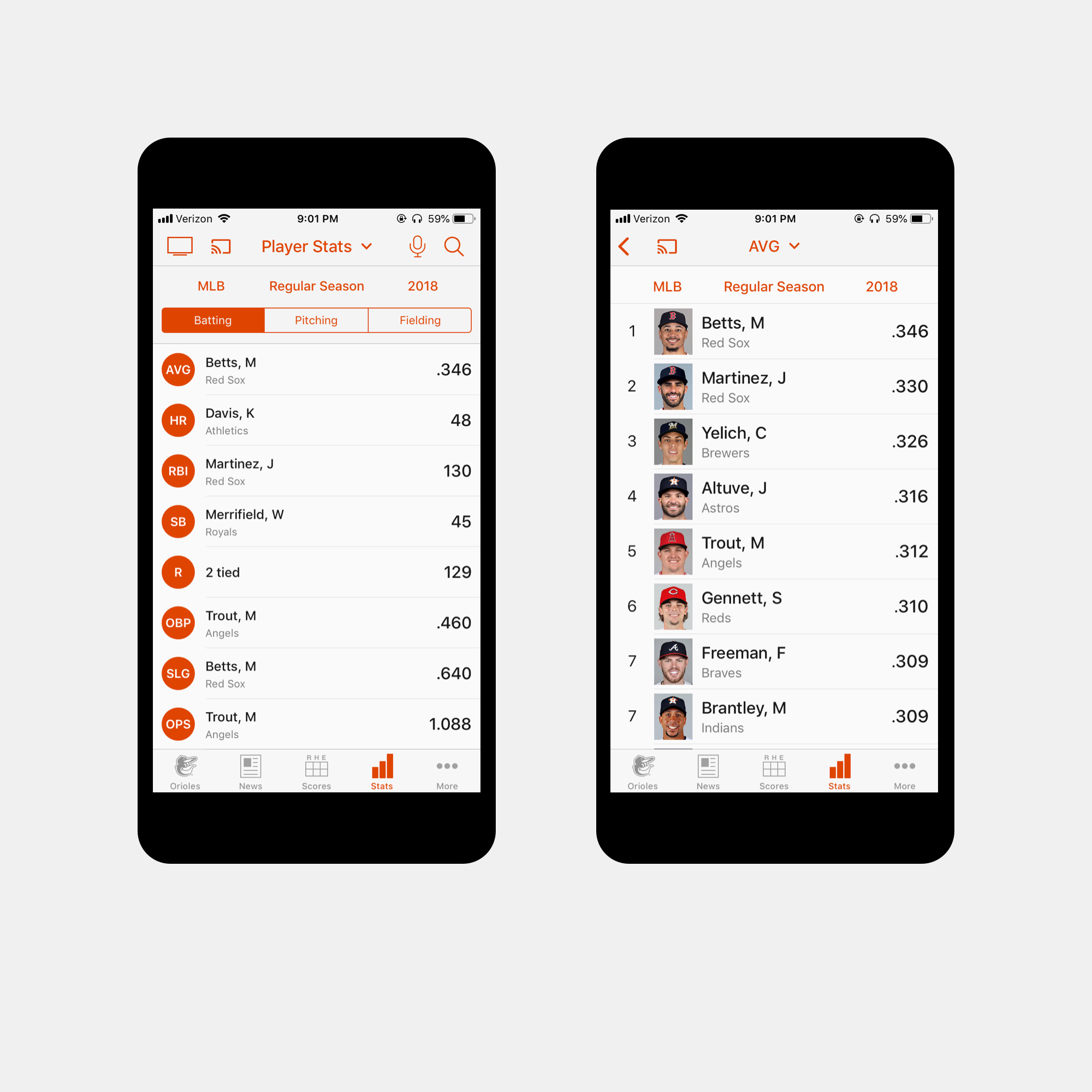
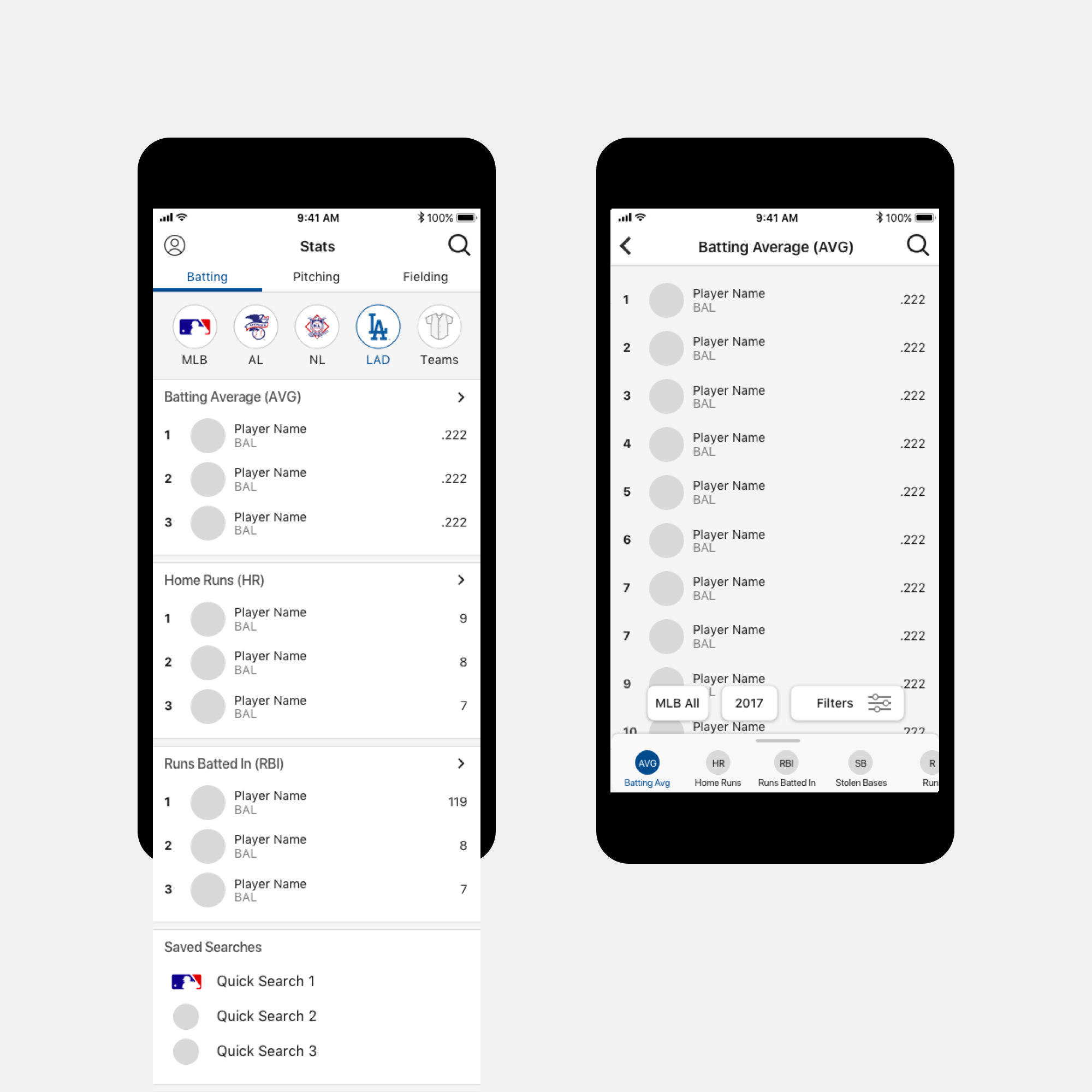
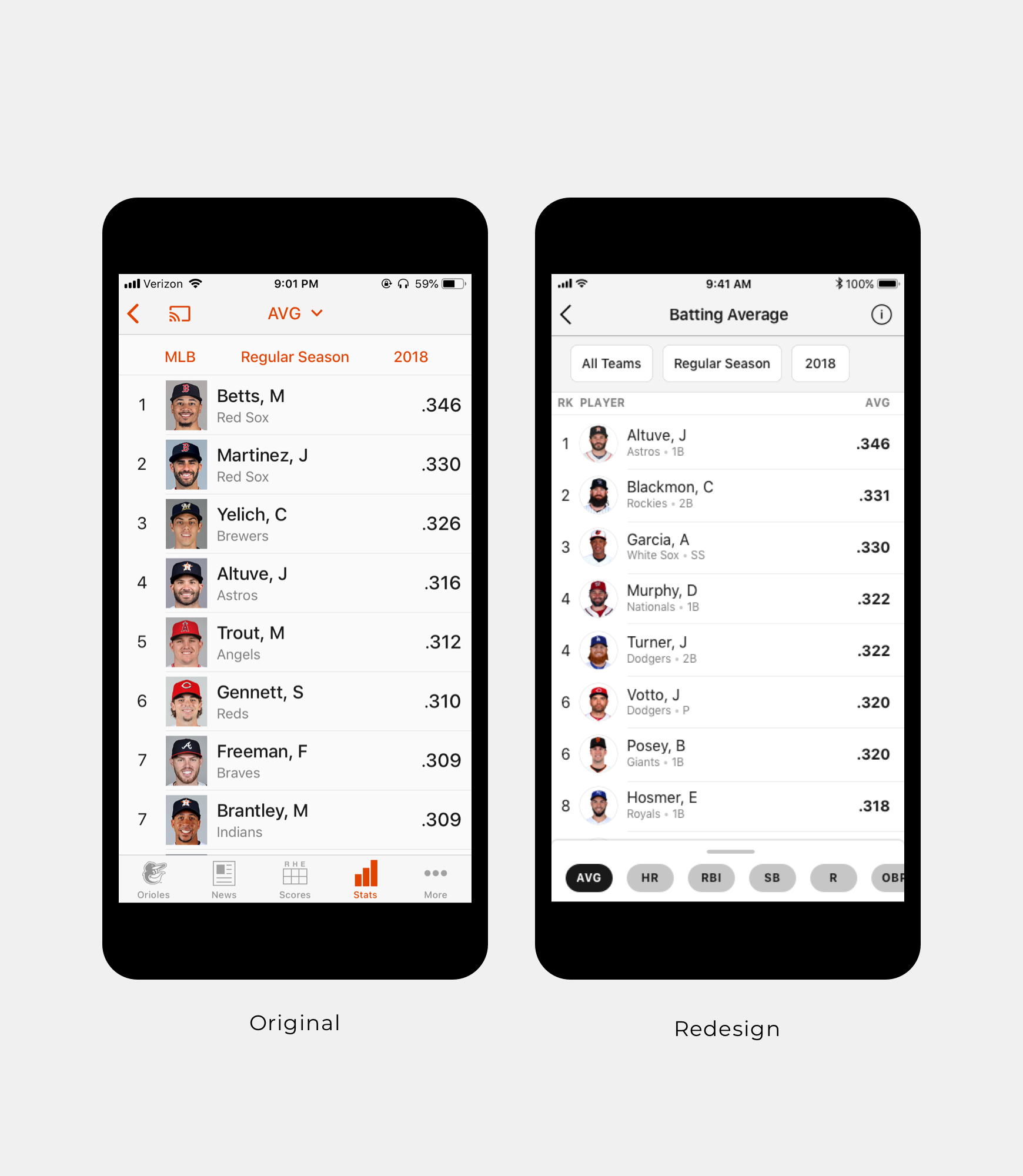
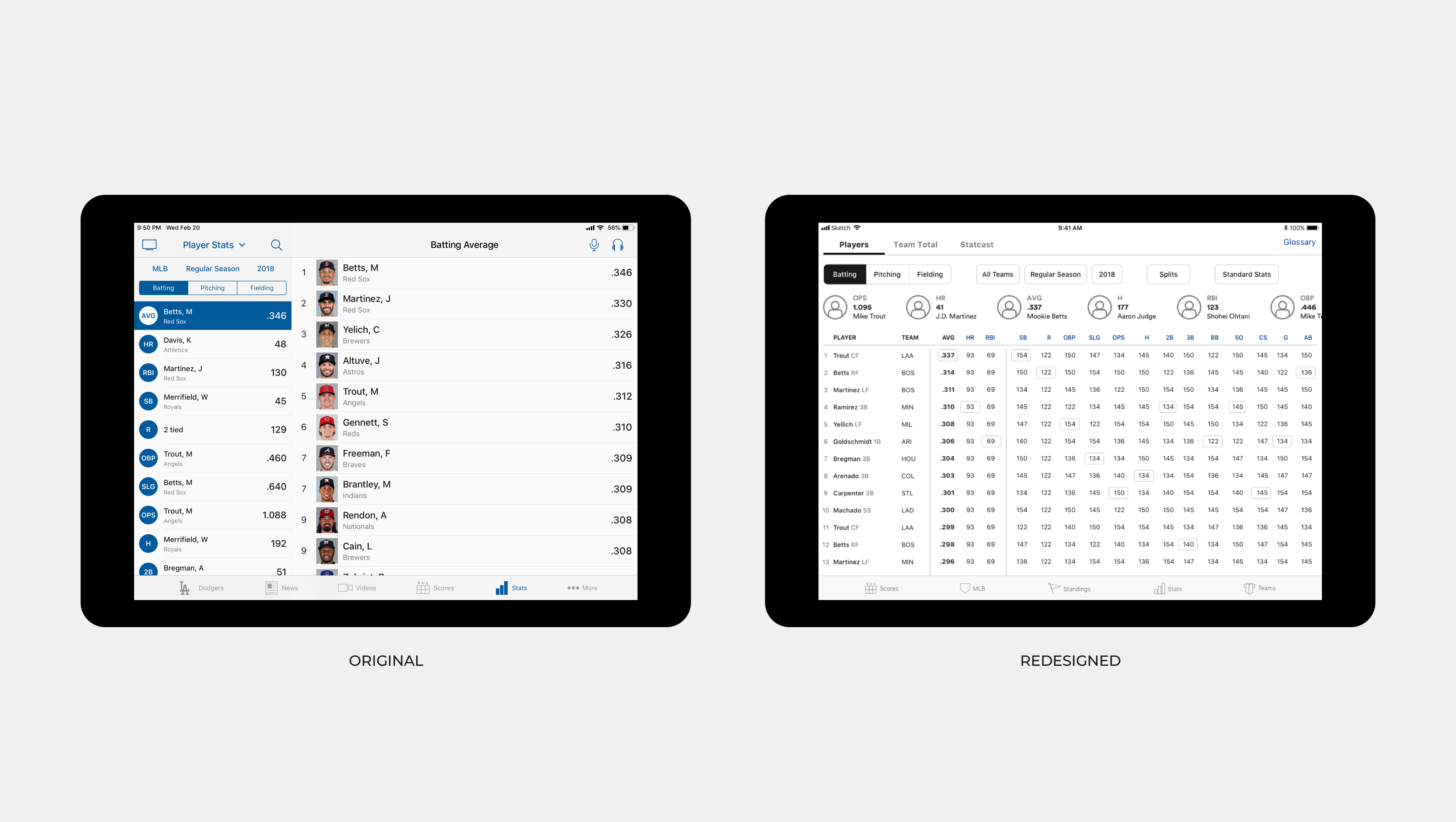
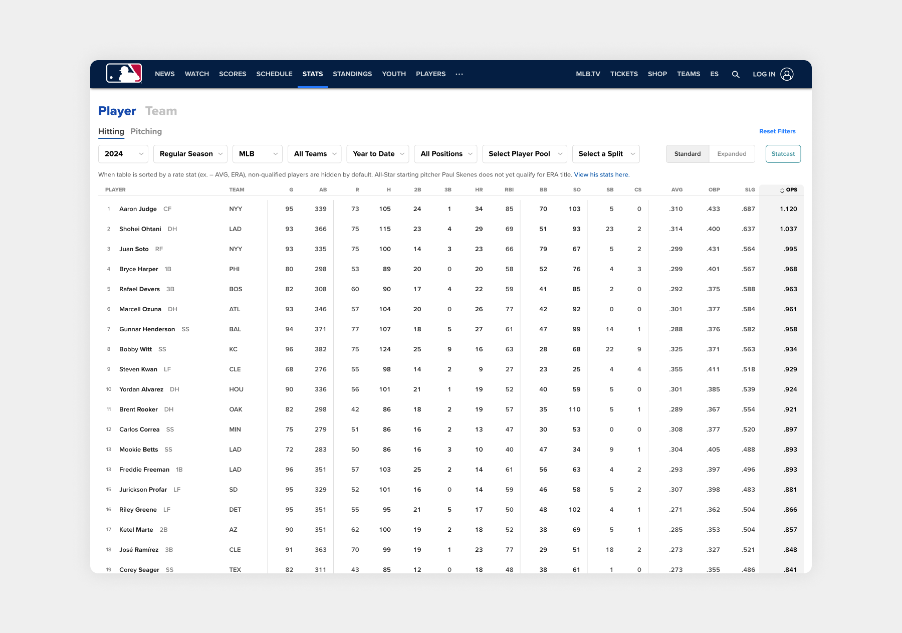
Based on my findings of user behavior across device types, I determined that the iPad experience wasn't solving users' needs given the available screen real estate. While iPhone users were more likely to look up a single stat or look up a specific player, users on larger devices were more likely to compare stats across categories as well as between players. With this in mind, I opted for a sortable table view on iPad instead of the old two-column view.
 in Philadelphia