MLB: The Official App is the #1 app for live baseball and used by tens of millions of baseball fans.
MLB: The Official App is the #1 app for live baseball and used by tens of millions of baseball fans.
Lead Designer • iOS and Android • Product Design, User Research • 2017-2019
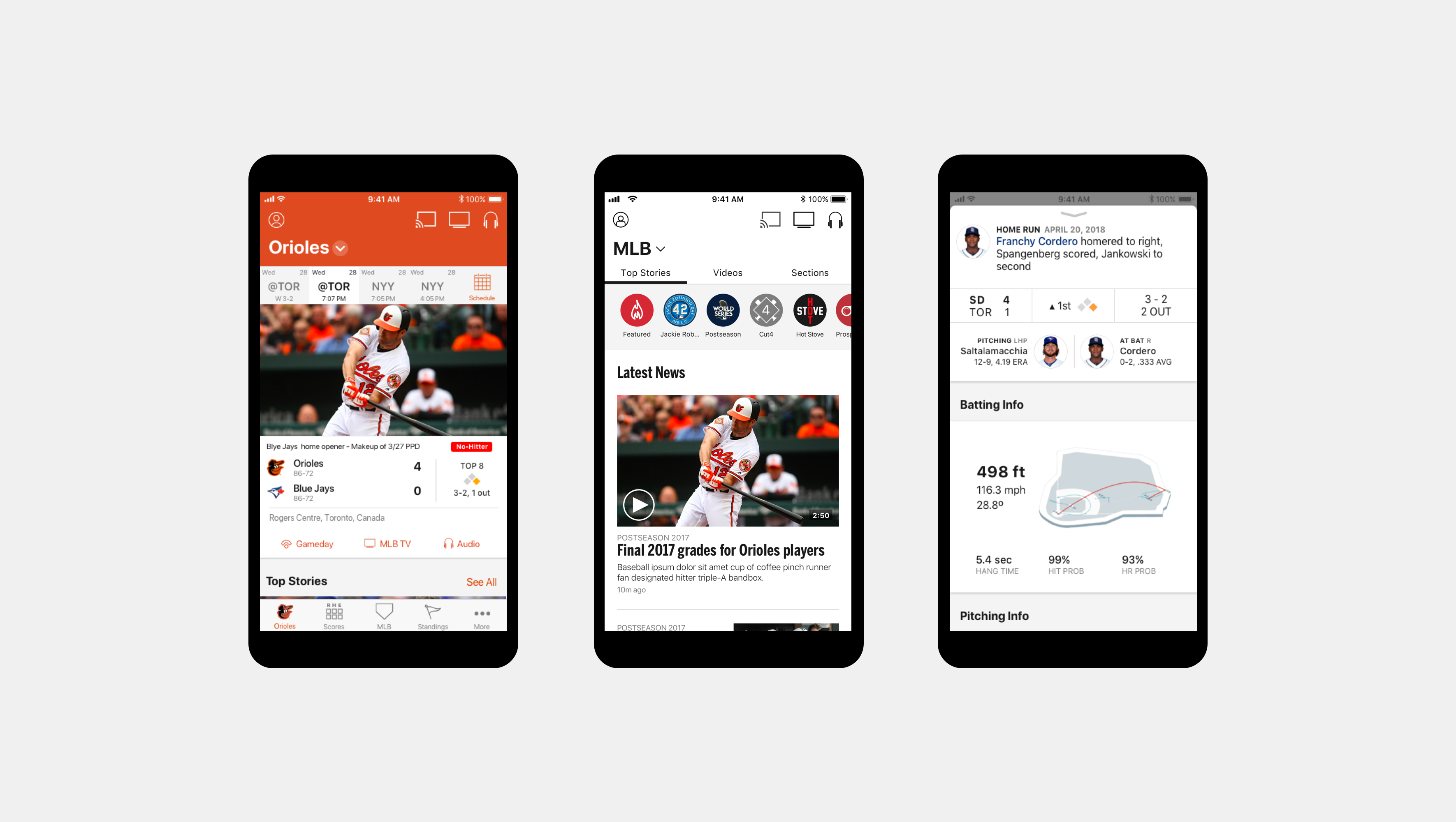
I was the lead designer on a world class sports app that connects users to America's favorite pastime - through live games, highlights, stats, and more.
MLB At Bat is the official app of Major League Baseball and is the way millions of fans watch games, keep up with their favorite teams and players, and dive into the world of baseball.
I was the lead designer of MLB At Bat and covered everything from product strategy and user testing all the way down to the minutae of asset management. It was my job to strike a balance between being an advocate for users and understanding the needs of one of the biggest sports leagues in America.
Redesigning a mobile-optimized stats experience
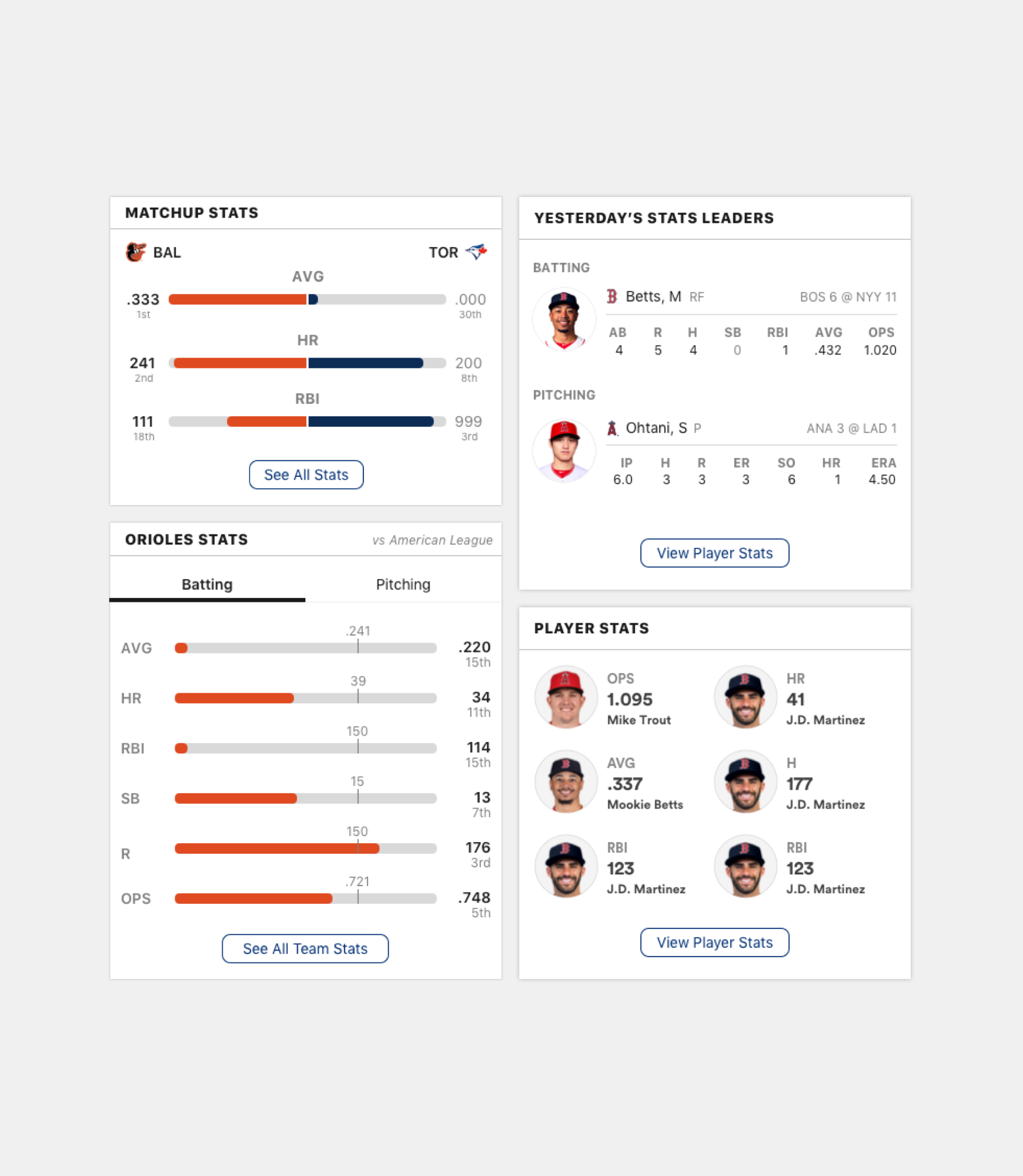
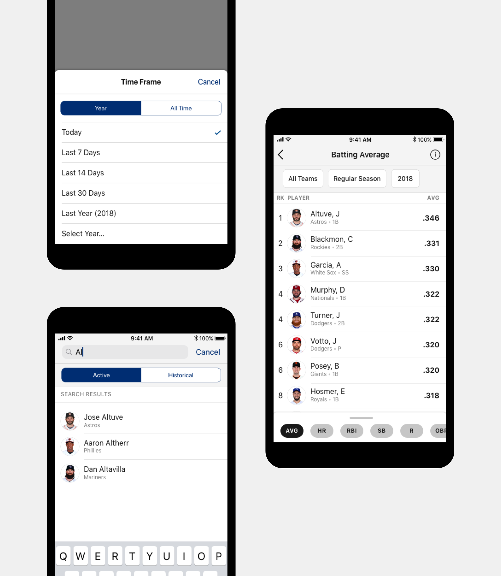
The stats experience on iOS (and later on mobile web) needed to adapt to accommodate the behavior of fans looking up players while on the go.
By conducting user research alongside a dedicated researcher and combing through data, we realized that there was a large difference in depth of page views, use of filters, and time spent looking at stats between a desktop and mobile experience.
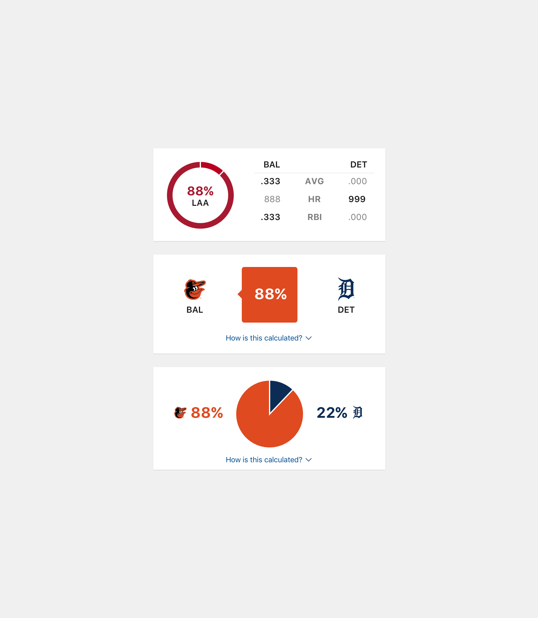
The redesigned stats experience is more lightweight (both in terms of visuals and load time) and answers the questions that users typically have when looking at stats based on user testing.
Making portrait video a richer experience
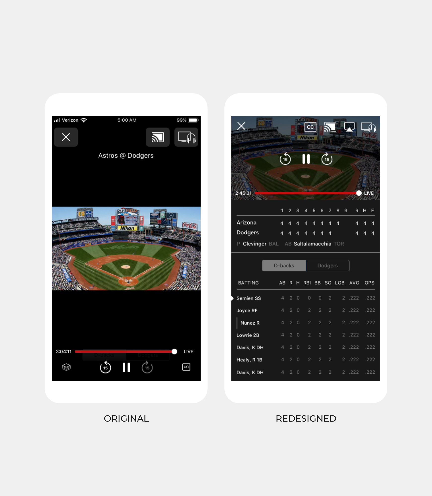
Our video player experience didn't fully utilize screen real estate in portrait mode, leaving large empty spaces above and below the 16:9 video.
We initiall explored the possibility of cutting different aspect ratios of video to better fit vertical mobile devices, but due to restrictions with how networks create their video feeds this proved infeasible.
Instead we decided to dock the video to the top of the view and added data panels in a scrolling view that provide more context behind the game.
 in Philadelphia